Linux @ slamfoo.com
Ubuntu 13.04 Review: Not Good.
May 9, 2013
Slamfoo Score
1
(out of 10)
"...proof that one can indeed polish dung."
1
(out of 10)
"...proof that one can indeed polish dung."
Summary
If you run one program at a time (use the internet, play a game, write a paper, manage a budget, etc) and you can afford to adjust your workflow just a little bit, and you do not mind having an advertisement engine integrated into your operating system, you may find Ubuntu 13.04 completely usable, even nice to work with.If you regularly multi-task, and do not have the time or desire to change the way you do things, or if you simply hate the idea of an advertisement engine built into your operating system, you will probably not like Ubuntu 13.04.
Installation and First Login
Installation was straightforward, and progressed quickly. The login screen looks nice but there is a grid of white dots all over the screen, making it feel a little unfinished.After logging in, I expected a notification telling me there were updates but never saw one. I waited a few minutes, completed a few other tasks, then started looking for a manual update option.
There is no traditional menu. The top button on the launch bar opens something called the dash.
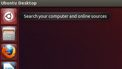
Clicking on the top icon opens the Dash.
The Dash lets you search for programs to run. I searched for the word "update" and this is what I got:
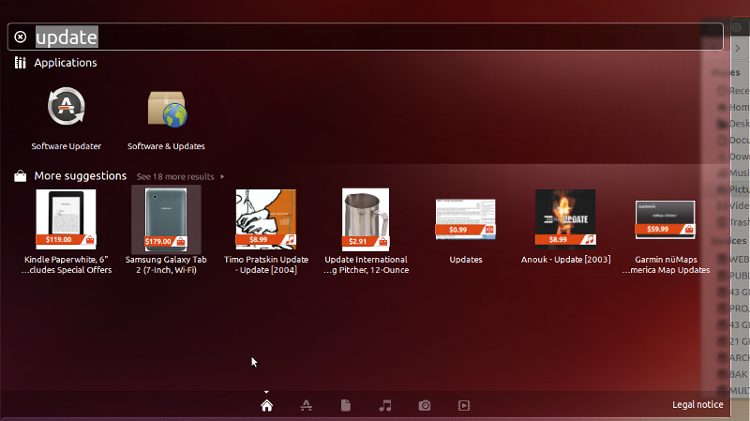
Dash search for "update".
I did not appreciate the "More suggestions" ads. More on that in a minute.
I ran "Software Updater" and there were updates available after all. This is the first distribution in a long time that did not tell me about available updates when logging in for the first time.
The Interface (Unity)
The interface is well polished, but many will find it frustrating, or even unusable.A side note on the Unity interface
In my opinion, Unity is a perfect example of a highly polished, poorly designed, unintuitive, user-unfriendly interface. In short, proof that one can indeed polish dung. Maybe it was designed for touch screens, or maybe it was designed with cell phones in mind, but it really doesn't matter. If I were a brand new linux user and I chose Ubuntu 13.04 to try linux for the first time, I would promptly reinstall Windows.The Review Ended Before It Began
To be honest, my Ubuntu 13.04 experience was ruined within one minute of logging in. I mentioned the "More suggestions" ads a minute ago, lets re-visit that. Think for a minute about how obsurd that is... look again at the suggestions that were given to me, remember I searched for "update".
Suggestions when searching for "update"
Imagine from the perspective of a brand new linux user. Ubuntu 13.04 may be the very first glimpse of linux that a new user sees. Having no obvious update option, the user searches for a way to perform an update, and this is what they get... Ubuntu tries to sell the user a Kindle?? a Galaxy Tab?? A 12 ounce frothing pitcher??
A really confused user may even see the $0.99 "Updates" item and think they need to pay to get their system updated.
As obsurd as it is to be presented with an ad to buy a tablet or a 12 ounce frothing pitcher when all I want to do is update my software... that's not the worst part.
After logging in, the very first thing I did was locate the screenshot program. Since it is not readily visible, I searched for it. This is what I got.
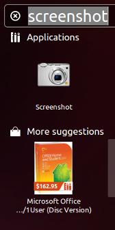
Searching for the screenshot application
generated an ad to buy MS Office. Nice.
What happens if a brand new linux user buys MS Office because Ubuntu suggested it?
At this point, I stopped caring about Ubuntu 13.04. I did my best to explore the system and the remainder of this review will detail what I found, but this completely ruined it for me.
The Dash is probably just displaying a search result from the internet, but from the perspective of a new user, who may not know any better...
Ubuntu is trying to sell me MS Office.
Everything else that I did was seen through that lense.
Usability
Unity alters the workflow for many common tasks.Main Menu
There is no traditional main menu. I do not understand removing something as basic and proven as the main menu. I did find a way to browse the applications without searching for every program individually, but unfortunately the option was not immediately obvious.When the Dash is opened, there is a row of icons along the bottom, it would be really nice if those icons provided tooltips.
Icons across bottom of Dash do not have any tooltips.
The second icon is the Applications tab.
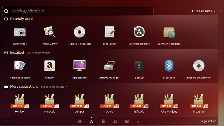 Dash Applications Tab
The "Filter results" button displays filtering options.
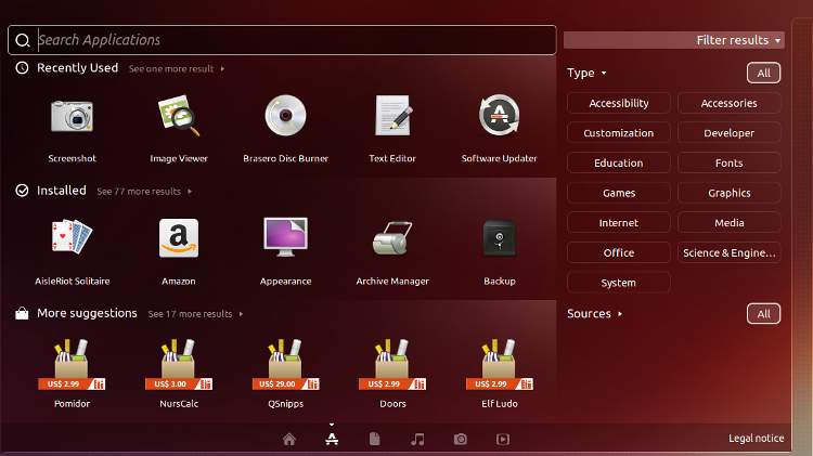 Filtering Options
From there you can choose the category and find whatever application you need. This seems cumbersome, and it takes too many mouse clicks.
With a traditional menu, all I had to do was hover over the menu, then hover over the category, and choose the desired program.
Now I have to click to open the Dash, click to go to the applications, then click the category, then scroll over to where the program is, and then click the desired program.
I do realize that one could simply add every application they use to the launch bar, or add a shortcut to the desktop for every program they run, but that seems to me like an unnecessary workaround for basic functionality.
On that note, there is no right click menu for creating shortcuts, the only way to make a desktop shurtcut or to add the application to the launcher is to drag the icon.
Anyone who has been around a while will know why you don't just start dragging things around in a new system. You never know whether it will copy, or move, or just get
lost somewhere never to be found again. Ubuntu does make the shortcuts correctly, but a context menu option would remove the ambiguity.
Window Controls
If you have used Ubuntu in the last couple of years, you are already familiar with the window controls being moved to the left side of the window.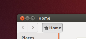
Windows controls on the
left side of the window.
This is just annoying. I know there is a way to have them moved back to the right. My main complaint here it that the option to move the controls back to the traditional position should be available in the settings, and it is not.
Global Menu Bar
All application menus now appear in the top global menu bar. This is by far one of the worst aspects of the Unity interface. It is confusing and will likely frustrate many users. What's worse is that the menus are hidden by default. It took several minutes to even figure out that there was a menu there.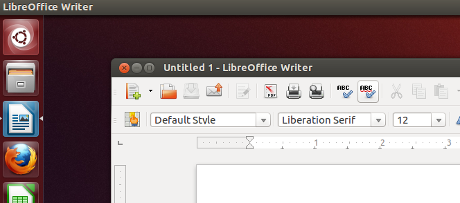
Notice there is no menu on the LibreOffice Writer window.
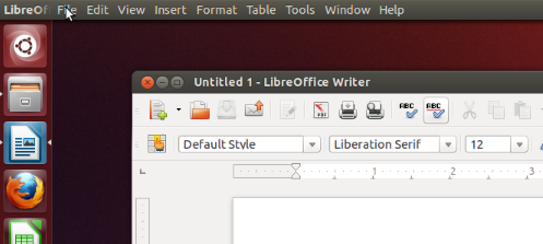
The LibreOffice menu appears in the global menu only when the mouse is over it.
Here is a real world example of why this is so stupid:
Working with GIMP, imagine you need to copy a portion of image A and paste it as a new layer on image B. Gimp sometimes is kind of flaky when I try to use shortcuts to paste, so I always use the menu:
Edit -> Paste as New Layer
The old (normal) way:
1. Make selection on image A
2. copy
3. click the Edit menu on image B (this selects the menu but also changes focus back to image B)
4. Paste as New Layer
The new (global menu bar) way:
1. Make selection on image A
2. copy
3. click on image B (change focus back to image B so that the global menu will apply to image B)
4. click the Edit menu
5. Paste as New Layer
Notice the extra step. You may think a couple of mouseclicks are no big deal, but over the course of a day, for heavy multi-taskers, alot of time can be lost to unnecessary mouse clicks. Even if you use keyboard shortcuts instead of the mouse you still have to switch focus back to image B before your keyboard shortcut will work.
File Manager
This is not as big of a deal for new users, but there are no admin or root options available in the file manager.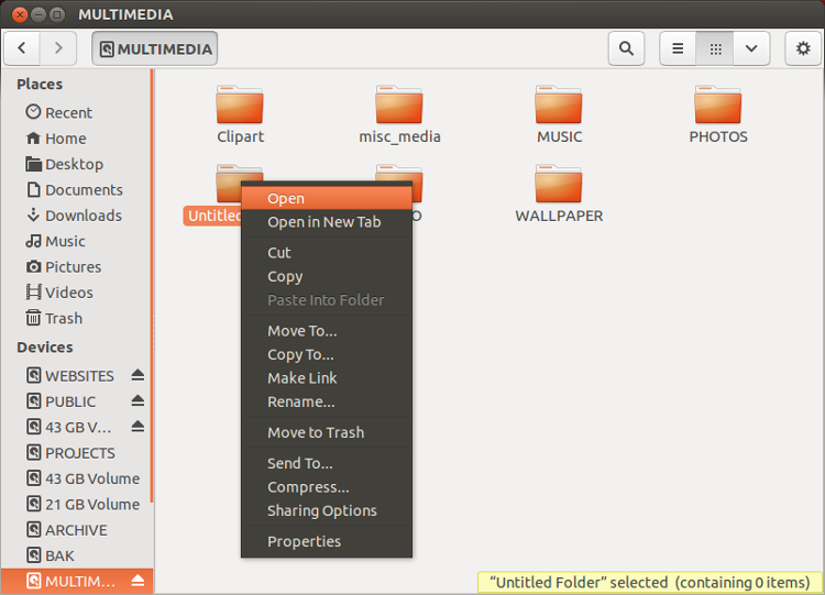 File manager context menu.... no admin options.
Settings / Options
There are not enough settings or options provided to alleviate the workflow/productivity issues.Other Observations
This is also probably not a big deal for new users, but there is no option on the desktop context menu to open a terminal window. Small gripe, I know, but the little things do make a difference.Conclusion
I imagine diehard Ubuntu fans will like 13.04 it no matter what. For everyone else, if you only use one program at a time, in full-screen mode, and like to buy random crap from the internet, you may very well like Ubuntu 13.04.If not for the integrated ads in general, and the MS Office ad in particular, the score would be higher. I would have probably seen all aspects of the system in a better light, but as it is, I just could not get past it.
Slamfoo's Linux Review Philosophy (Ubuntu 13.04)
Since Ubuntu is primarily geared towards the new linux user, this review was conducted from the perspective of a new user, keeping these things in mind:- A poorly designed, non-intuitive interface, no matter how good it looks,
will end up driving potential linux users away.
-
A user may not have the time or the desire to completely relearn everything they know.
It should take no more than a few minutes to become productive on a new linux installation.
Scoring Details (max score = 10)
General Appearance (max = 2)
+2
Clean, modern look.Usability
+2
Common Simple Tasks, One application, One instance (max = 2)Running one app at a time, single instance, in full screen mode presents no problems.
0
Multitasking (max = 2)Global menu bar greatly reduces productivity.
+1
Learning Curve (max = 2)Learning curve not too steep, but could affect productivity while adapting to new interface.
0
Settings (max = 2)Not enough settings or options provided to alleviate workflow/productivity issues.
Other - Anything else that made an impact (positive or negative)
-2
Advertising integrated into Operating System.-2
Not filtering the advertising (suggesting MS Office is a HUGE fail).